
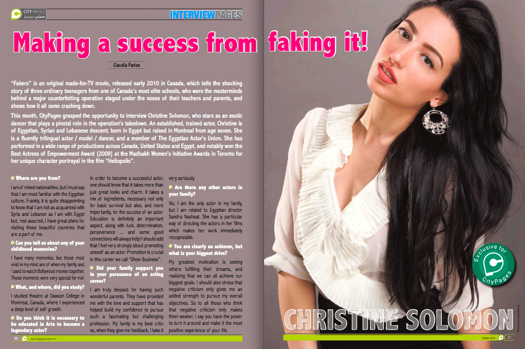
I like this layout because it shows a main picture of the person been interviewed and on the other page states the interview with a subtitle which is a quote with main word in Bold lettering! This magazine layout look clean cut and professional!
This isn't my favorite interview layout as I think it looks to literal and tacky! But on the other hand I like how they have decided to lay it out with a main title followed by interview and a fantastic picture the chosen person!

When I start constructing my magazine article on Photoshop, I will be paying close attention to make sure the layout turns out something like this. It looks professional and would suit a high street fashion magazine!
With a professional picture on the left followed by interview, pictures and quotes to make the interview look real and not staged!
No comments:
Post a Comment